graphic
design
: that enhances branding strategies by fusing
intuitive artistry with analytical reasoning
photography
marketing




FOURTH LETTER DESIGN - PHOTOGRAPHY
deadra renee'
(DAVIS)
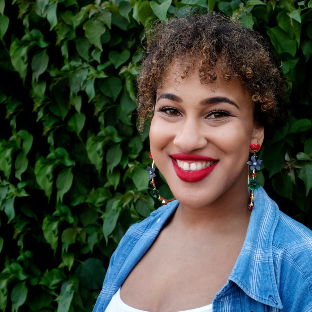
also known as Dee (The Fourth Letter)
Artistic expression is MY PURPOSE...
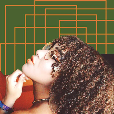
As a Los Angeles native, I learned early in life the power Creatives have in shaping the world. I feel genuine bliss when I curate art that can transcend beyond visuals and speak directly to an individuals' soul. Design is a method of communication, and I crave depth in all forms of expression. The mission of Fourth Letter Design is to create thought-provoking message design that adds value to the consciousness of society.
WHo AM I?
SKILLs
overview
I graduated Magna Cum Laude with a B.A. in Strategic and Corporate Communication complimented by a minor in Graphic Design.
Marketing communications' training combined with graphic arts enables me to
effectively execute brand campaigns from conceptualization through completion.
specialities
01
DIGITAL MARKETING
05
PHOTOGRAPHY
02
ECOMMERCE
06
PHOTO RETOUCHING
03
PUBLICATION DESIGN
07
VIDEO EDITING
04
BRAND ID & DEVELOPMENT
08
CREATIVE WRITING
2020 - PRESENT
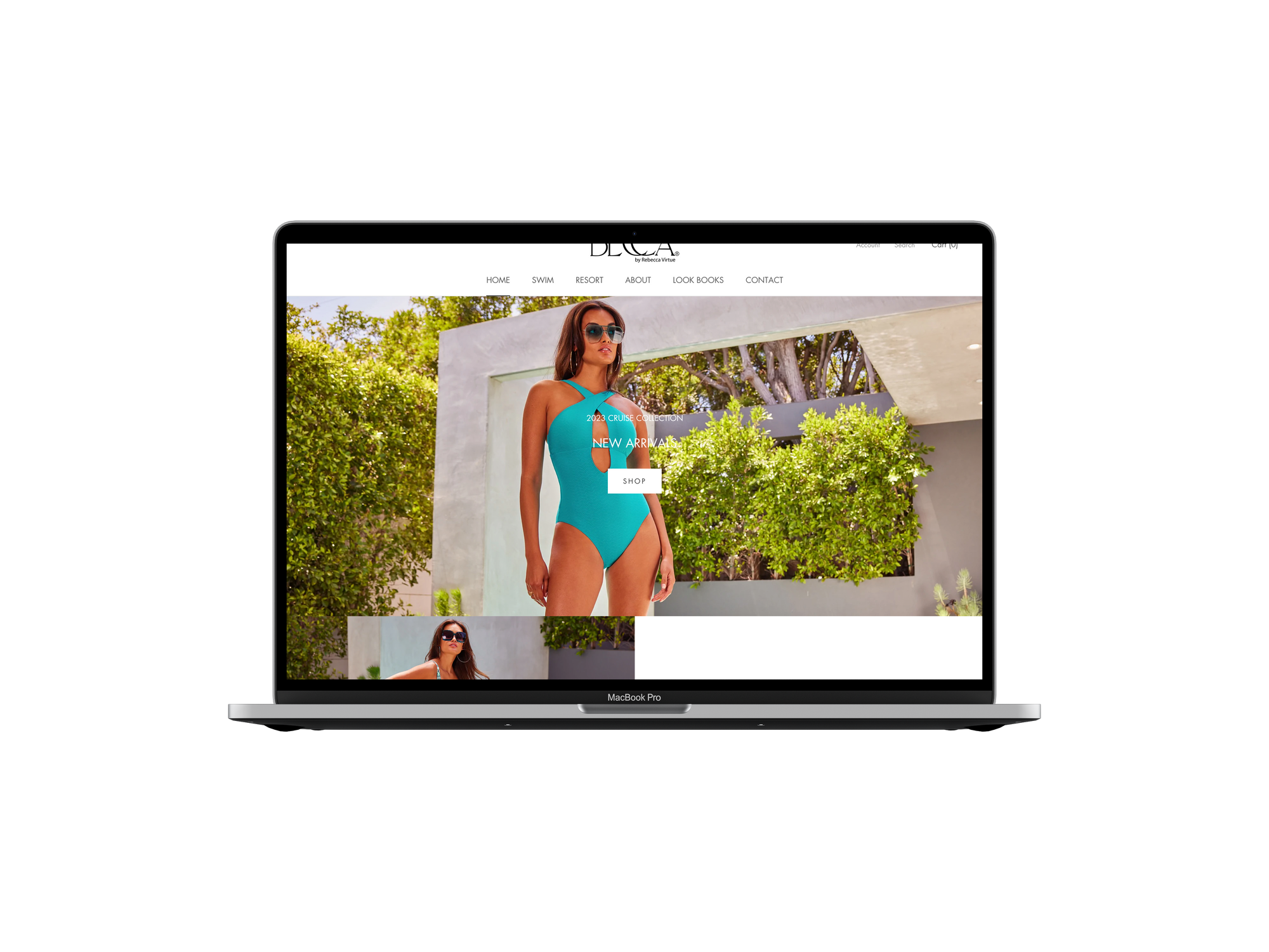
eCommerce Specialist: design and merchandise eCommerce platforms | create digital and physical marketing materials (i.e. LookBooks, email blasts, website banners, trade show posters, etc) | manage retouching / editing of product photography
2017-2014
Senior Sales Associate: assisted in store merchandising | POS eCommerce fulfillment | increased sales by establishing meaningful connections with customers

2019-2020
Digital Marketing Specialist: photographed and edited product images | designed digital & physical marketing materials including flyers, trade-show banners, Amazon A+ content pages | created layout and content for product catalog
2015
Graphic Design / Marketing Intern: worked with a team to develop a branding campaign for the Lunar Mission One space initiative program in London, England
2017-2019
eCommerce Manager: assisted the design team with creative content/marketing materials | designed, merchandised, and operated over 22 Shopify platforms for various music artists/bands
2016-2014
Graphic Design Assistant: designed marketing materials for Chapman University's department of Student Affairs | photographed on-campus events.
PORTFOLIO
ecommerce marketing + web design
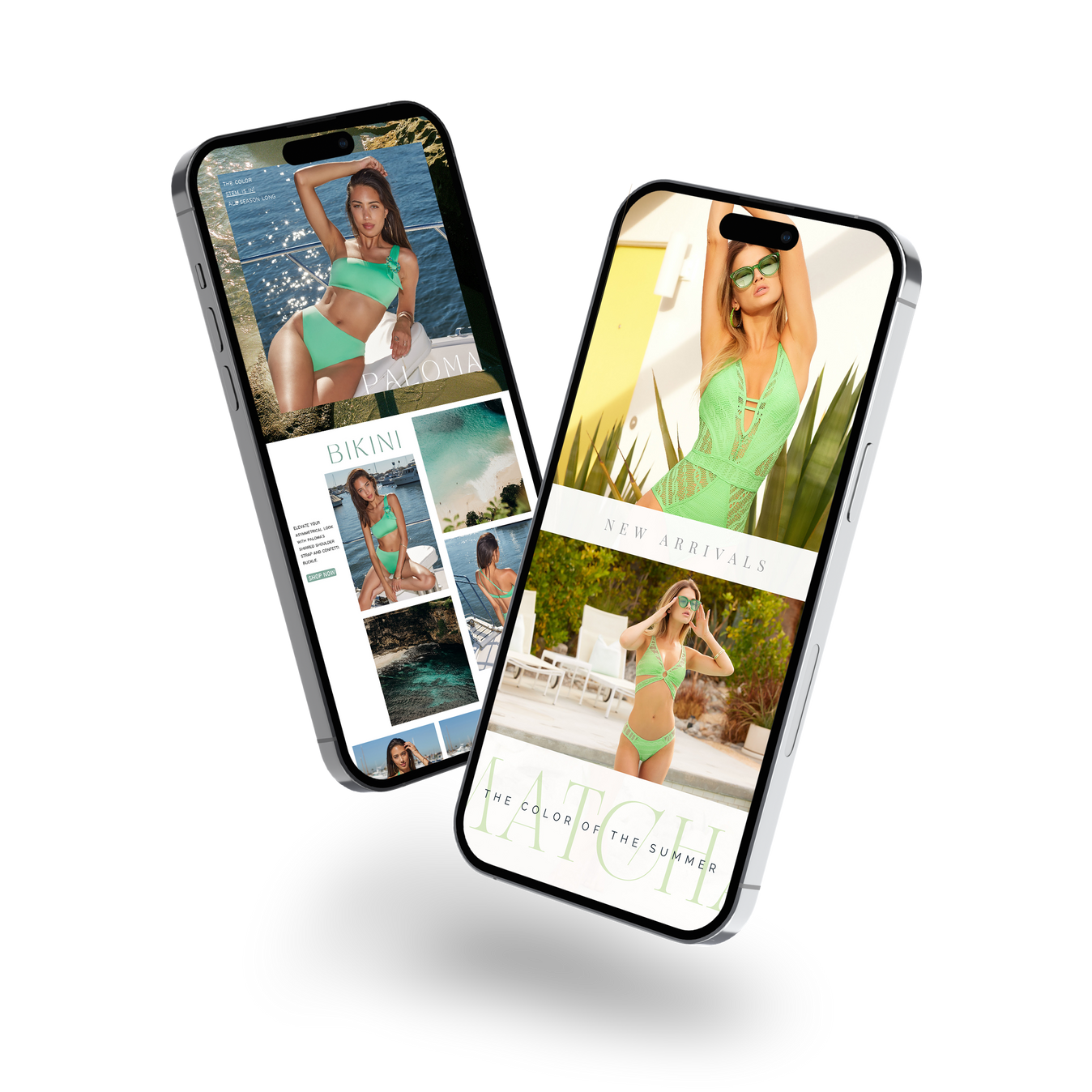
EMAIL CAMPAIGN EXAMPLES
01
04
02
05
03
06
CLICK LAPTOP TO BROWSE WEBSITE
album covers
01
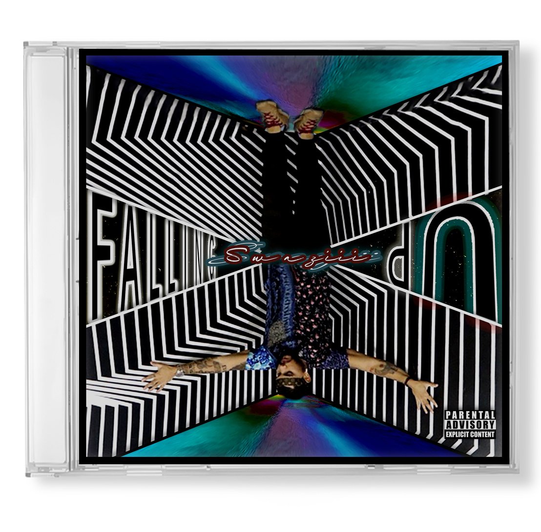
"Falling Up" Album Cover
Custom logo created for hip-hop artist Swaziii.
The cover design incorporates the idea of 'falling', but when the cover is rotated, both the artist and the word 'up' are in an upright position. The layout represents the artist's concept on shifting your perspective to change the trajectory of your life.
02
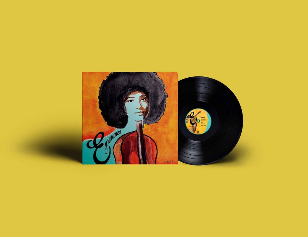
jazz album Cover
*Mock album cover design created using multi-media. Jazz is considered to be one of America's original art forms, therefore to honor 'original art' this album cover is hand-painted and embellished with graphic elements. The artwork for this self-titled album, ESPERANZA, was designed to represents how the cellist / singer embodies both passions in her music.
PUBLICATION DESIGn
01
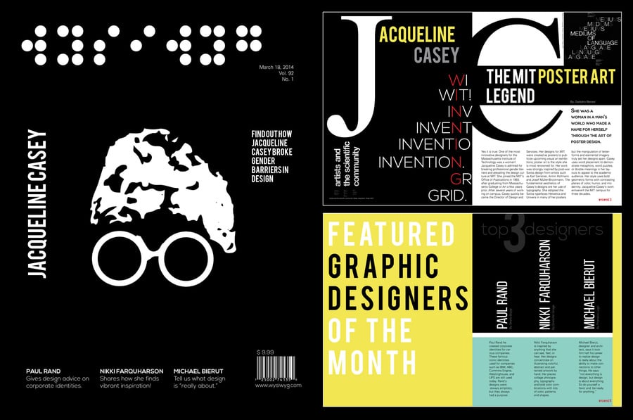
WYSIWYG MAGAZINE
The objective was to create a *mock magazine (5-page) layout that gave tribute to a renown Graphic Designer. The logo for the magazine title WYSIWYG (which stands for “What You See, Is What You Get") was curated using braille letters to symbolicalize that what you 'get' out of what you 'see' is not only about what is seen, but also about what is felt. The magazine features Graphic Designer Jacqueline Casey; adopting her style of solid black backgrounds, abstract figures in white, large rotating lettering, and word puzzles.
02
PRODUCT CATALOG
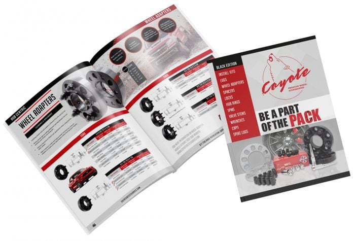
This 80-page catalog contains over 3,000 product skus that are organized by type and measurement for each wheel accessory part. The layout is custom designed, and includes product images that I both photographed and edited.
PATTERN DESIGn
01
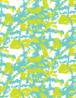
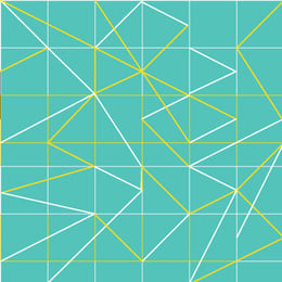
DIGITAL patternMAKING
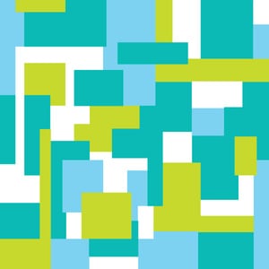
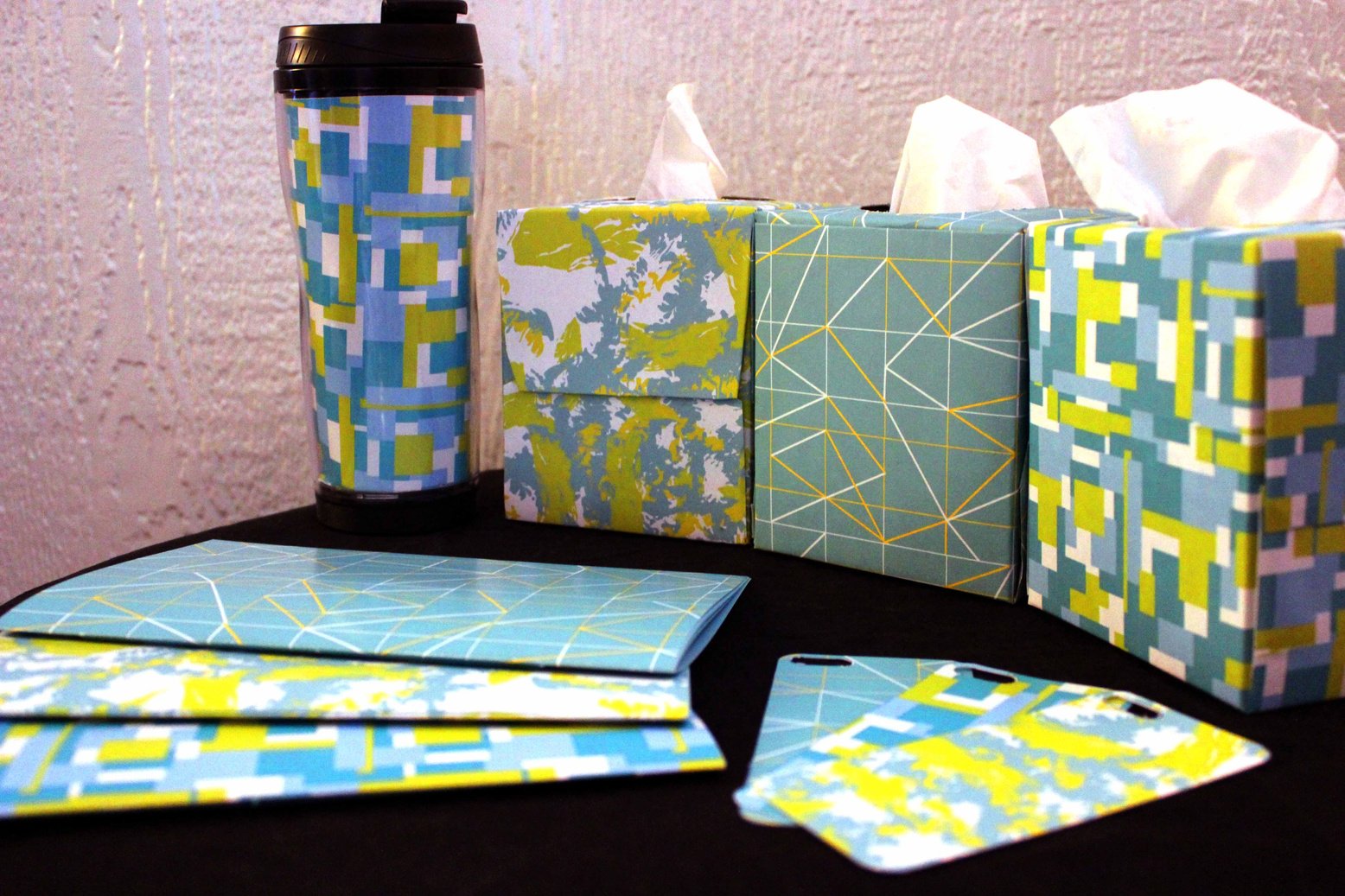
These products were created from digital pattern designs. The abstract designs were styled to have the same color-story yet distinguished pattern variations.
BRANDING + LOGO DESIGn
01
"THE HOLE" MENU
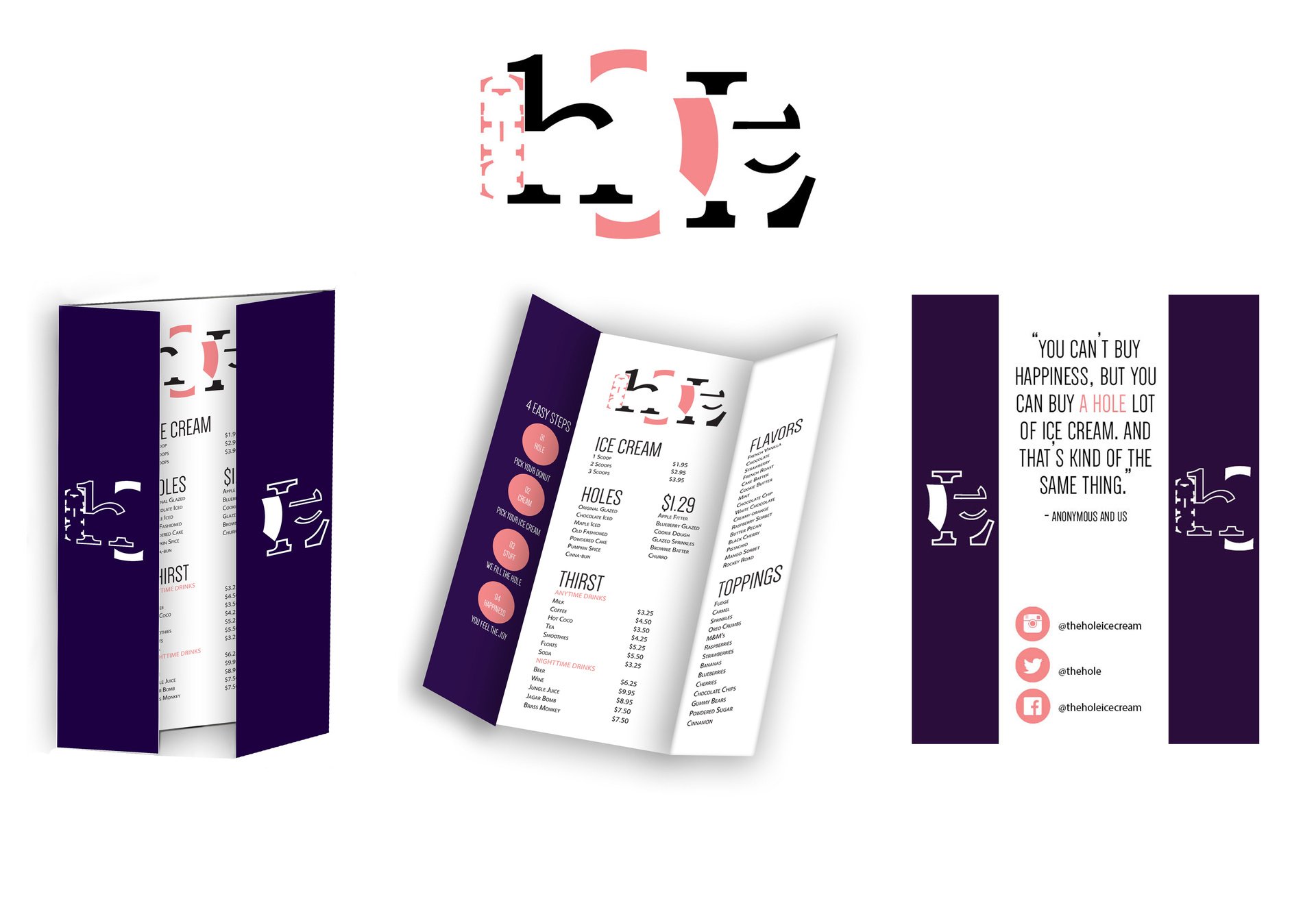
Custom Logo and *mock menu design for an ice cream sandwich cafe. The logo challenge was to remove as much of the alphabet lettering without loosing readability. The concept for the cafe’s aesthetic is for customers to feel like they have just entered a secret cozy cave; to convey that vibe the menu is split down the middle to replicate entering The Hole and uncovering delicious secrets.
02
"ELEMENTS" TEA PRODUCT LABEL
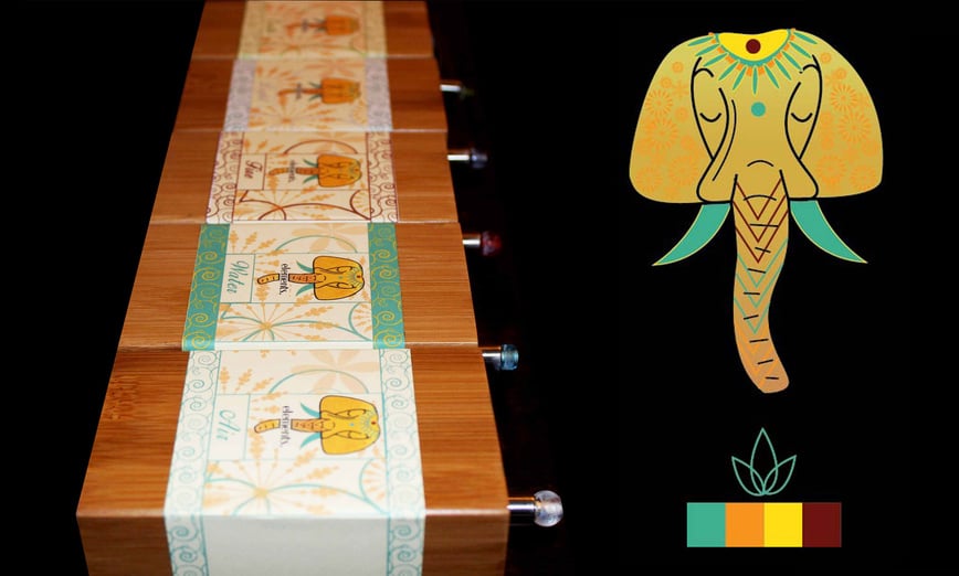
Custom logo and branding concept for a *mock herbal tea company. The selected brand name "Elements" references the components of the earth in relation to the tea's organic ingredients. The package design correlates the (5) tea flavors to each element. The brand name, label design, and logo were thoughtfully designed to appeal to the company's target tea-drinking ‘bohemian-inspired' consumer.
POSTER DESIGN
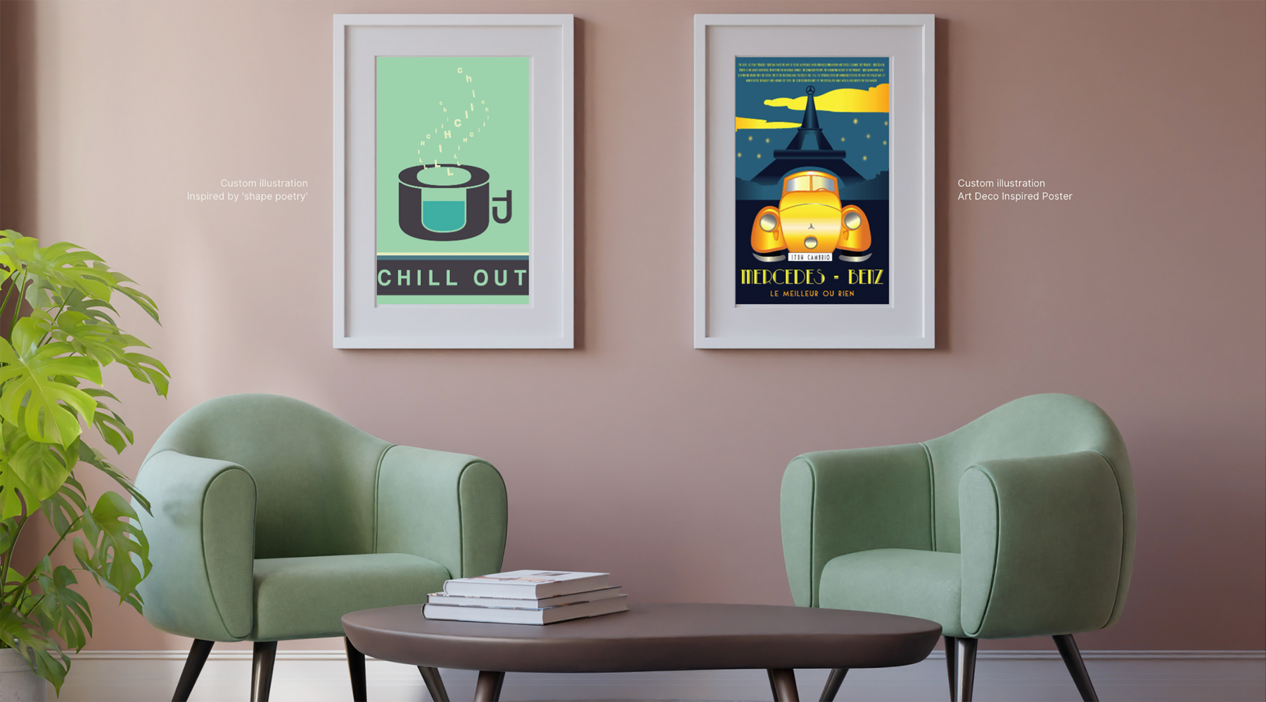
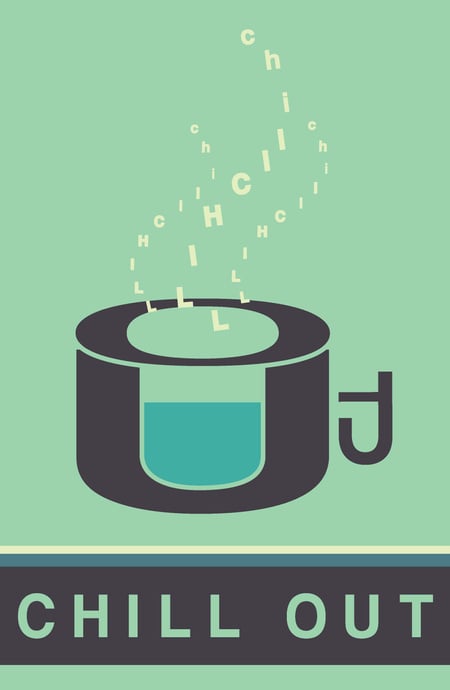
Custom illustration
Inspired by 'shape poetry'
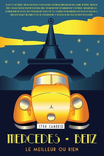
Custom illustration
Art Deco Inspired Poster
CONTACT

let's Work togetheR
E-mail
4thletterdesign@gmail.com
LinkedIn
www.4thletterdesign.com
